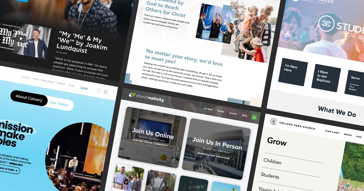
Our team has been designing and building websites for churches for over 20 years. During that time, we’ve seen a lot of trends in website design and functionality. As designers, we’re always looking out for new ideas and what’s the most current trend. There are some amazing designers and developers out there serving and supporting the church, and we admire them for their passion for the Kingdom as well as their creativity.
Below is a list of some of the most innovative, helpful, and beautiful church websites that we love, and sites that we believe offer real-world ideas that any church leader can learn from!
But first, let’s share a little bit of what we’re looking for in a good church website.
What Makes A Good Church Website?
Intuitive Design
Design is there to help the user, not necessarily show off how creative you are. We’ve experienced sites that are so beautiful, but we can’t figure out how to use them, or they require too much effort. Design should help the user to identify the most important content, lead their eye to navigation elements, and support the brand identity of the organization.
Thoughtful Layout
This is similar to creative and intuitive design. However, it differs in that we’re talking about the actual order and organization of the elements to help users find the information you want them to find first. It is also about making it simpler to access the content they come to the site to view most often.
A Clear Visitor Experience
This is something that many churches struggle with internally. There’s a tension between making a site that’s primarily for their members, since they use it most often, and creating an experience that shows visitors that you thought of them and care about them. There are several different solutions to this, but we look for solutions that show care and concern for the first-time visitor while not making things harder for the primary website user: the member.
Church Website Examples
With that said, here’s a quick list of our favorite church websites.
College Park Church
https://www.yourchurch.com/
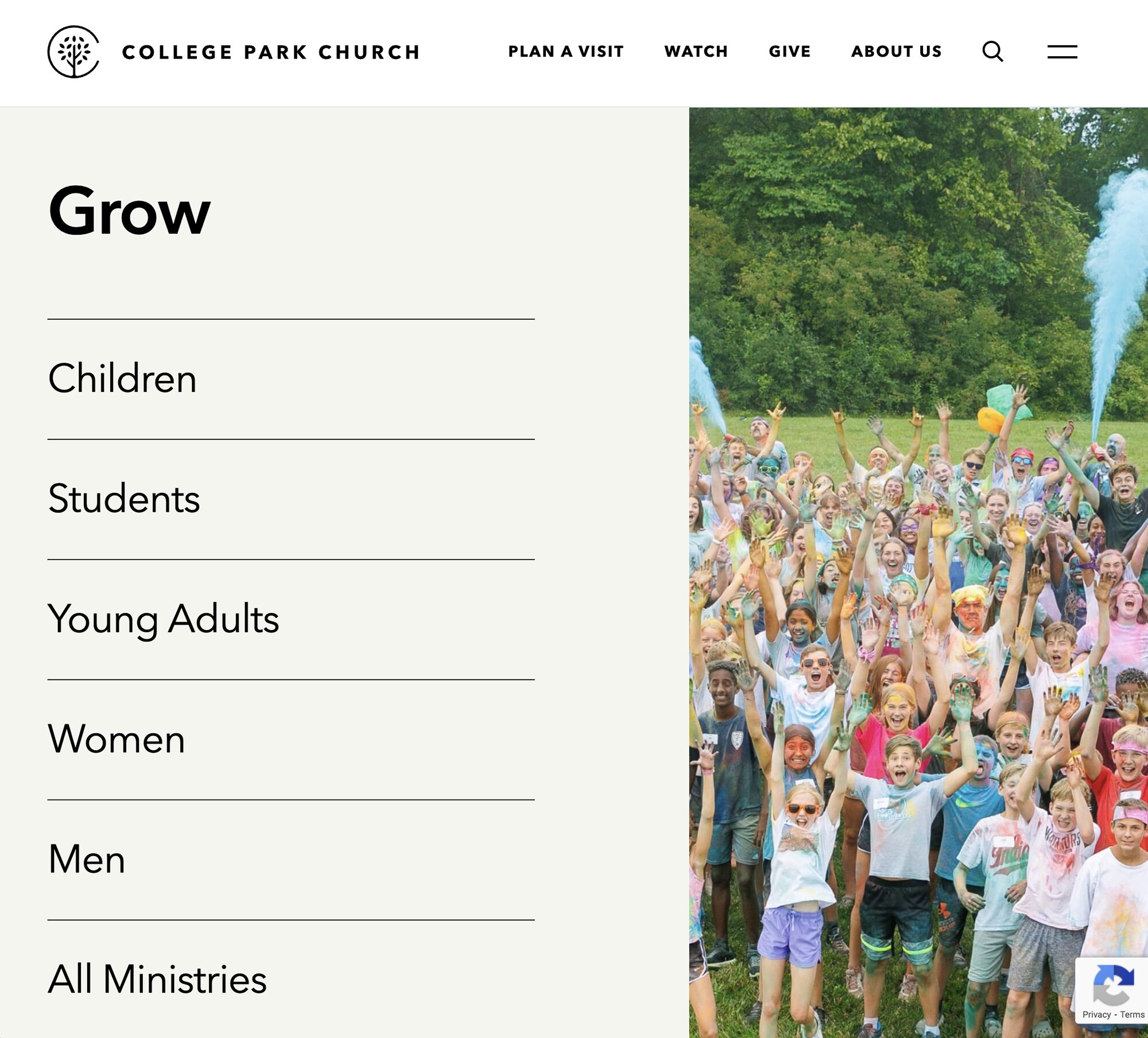
I have to start this list with my personal favorite church website for College Park Church, designed by the team at Each+Every. I know it’s weird to give a shout-out to another firm, but I love this site so much I personally messaged them to tell them! I love the use of typography on this site, the big bold headlines, and the intuitive layout. They also use one of my personal favorite types of navigation — a combo of a traditional nav and a hamburger. This puts the most often clicked links outside the hamburger, while giving quick and full access to all the links inside. The whole site is beautiful, and there are little easter eggs of functionality embedded throughout.
My one recommendation for them has to do with the absolutely beautiful navigation. It’s a lot. When I open it up, I’m immediately hit with decision fatigue. Also, there’s a little disconnect for them; the large links aren’t the same as the ones outside the hamburger – it is close but different. I’d recommend aligning those two sections and then either reducing the overall number of links or using expanding sections to help reduce the number of available choices at first glance.
Gateway Church
https://gatewaypeople.com/
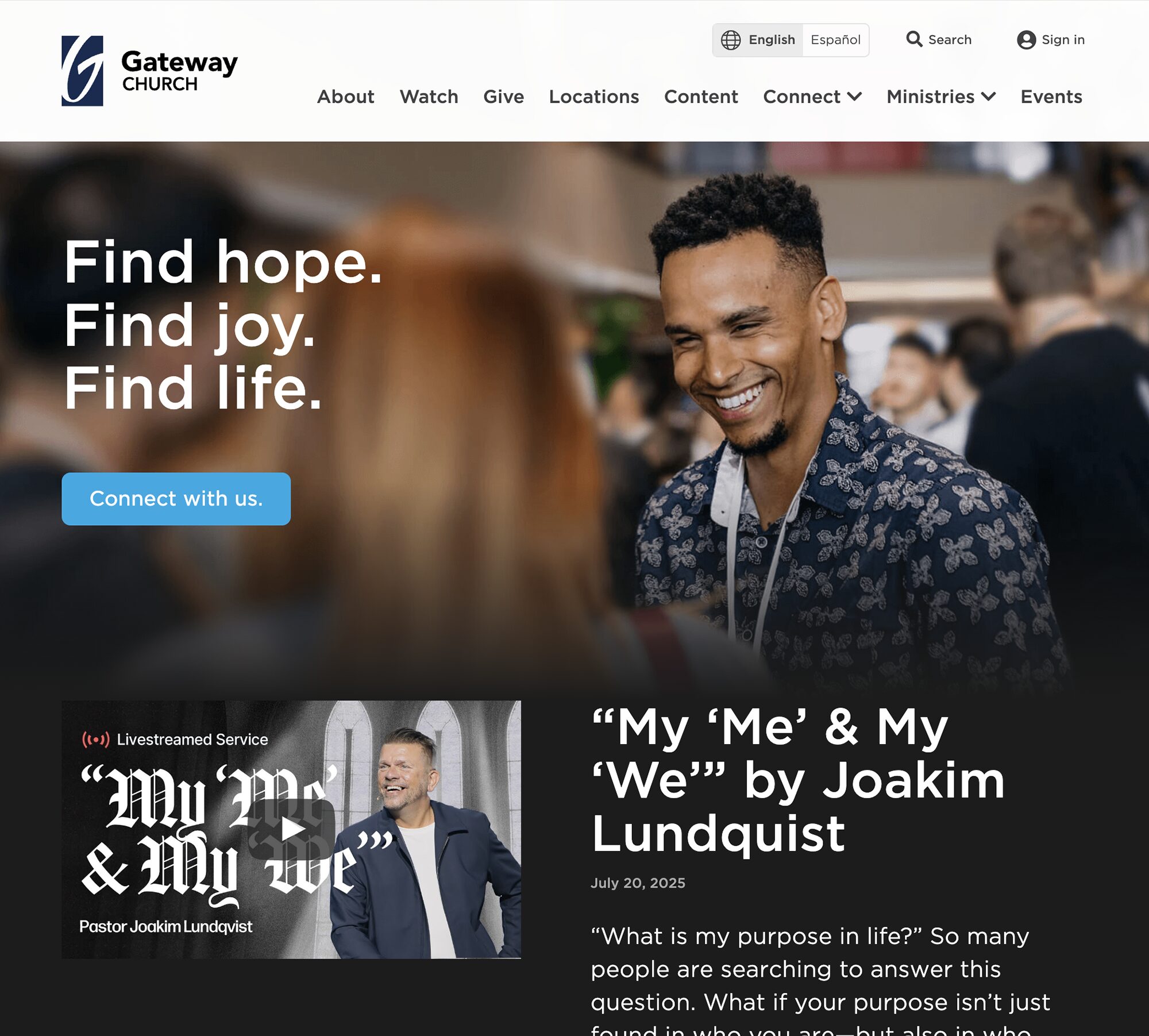
Gateway Church’s homepage feels immediately familiar. Their hero seems to randomly rotate a few mottos that feel warm and inviting. The site uses a more traditional navigation, versus the more common hamburger that is intuitive and uses non-churchy language that people can connect to. At 8 links in the main navigation, it’s starting to get a little busy, but they pull it off. While not having an obvious “visitor” pathway, the links and navigation, like “about” and “connect”, are obvious enough that people looking to connect with the church will know how to. If we could give them one recommendation, it would be to increase the whitespace on their homepage to make the page more easily scannable. It’s beautiful, but it comes across just a tiny bit busy – a little extra padding and margin could remove that and make scanning simpler.
Calvary Fort Lauderdale
https://calvaryftl.org/
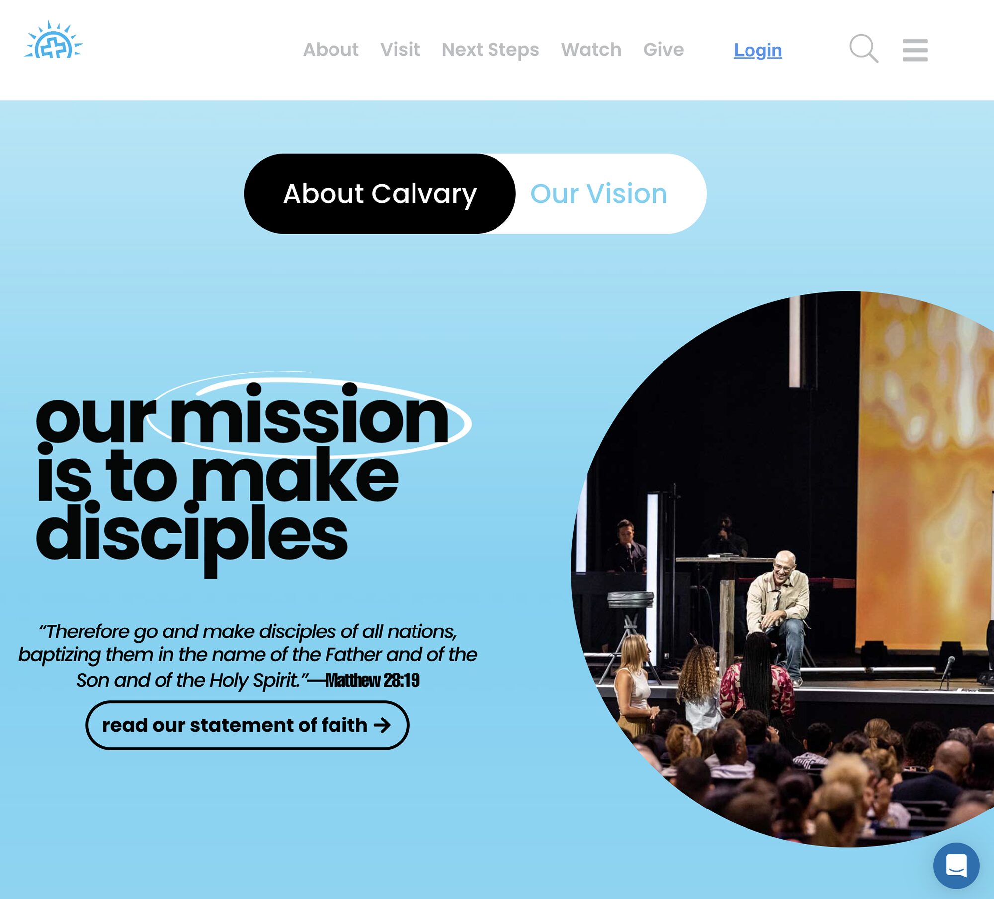
Calvary Fort Lauderdale is a site that Juxt launched around the beginning of 2025. I overall love the non-linear design that still feels intuitive. Additionally, there’s a heavy focus on making actionable links obvious. The general order and layout are helpful, especially for a church that has 12 campuses. The design also feels really on point for a church located in South Florida. You immediately get a vibe for who they are. One of the most challenging aspects of this site was the heavy use of sliders for navigation. This presented challenges in how to make something that was intuitive for both desktop and mobile users. I think we struck a good balance with a lot of collaboration from the team at Calvary, who were all amazing professionals to work alongside!
Clear Creek Community Church
https://clearcreek.org/
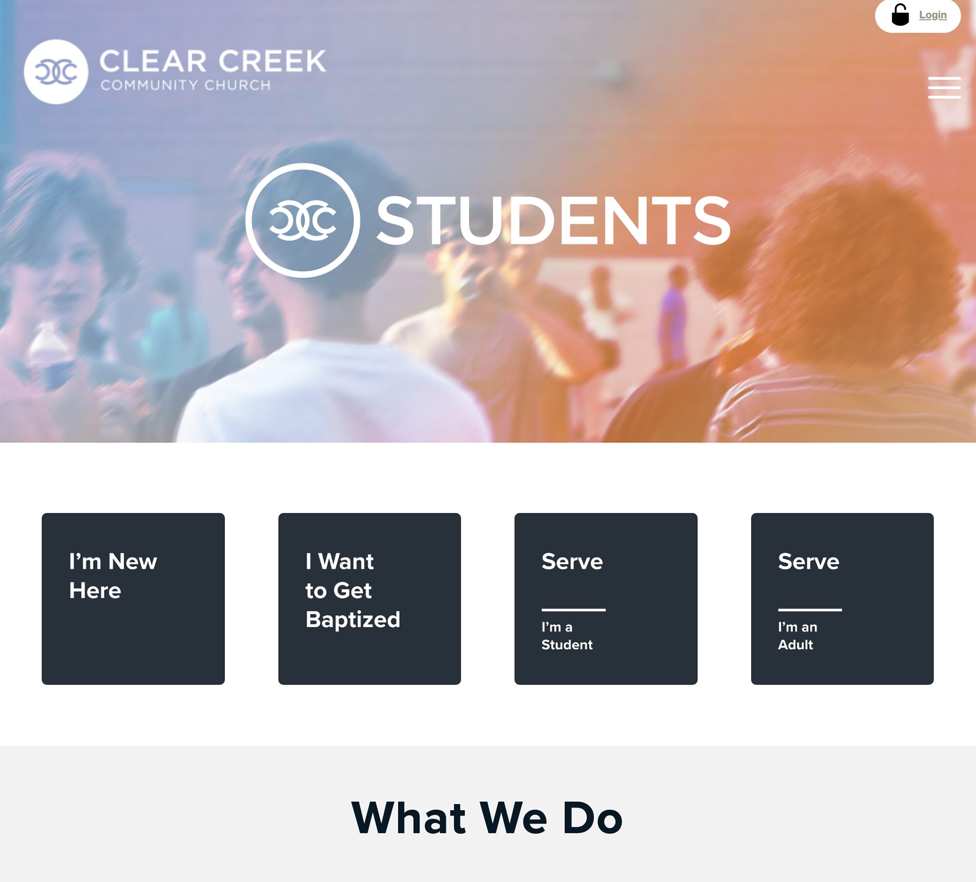
Clear Creek Community Church is actually one of Juxt’s oldest sites – and that’s one reason I love it so much. The design has really stood the test of time and allowed for iterative updates that have kept it fresh. The navigation on this site is long but works because of the use of font weights and sizes to clearly lead the eye to the most important information. The layout is simple and obvious, helping both first-time users and members find what they are looking for and keeping the most often accessed info top of mind. The layout works well, as it’s fluid, obvious, and easily scannable. Huge props to the team at Clear Creek that manages it and keeps the content fresh every day.
Eagle Brook Church
https://www.eaglebrookchurch.com/
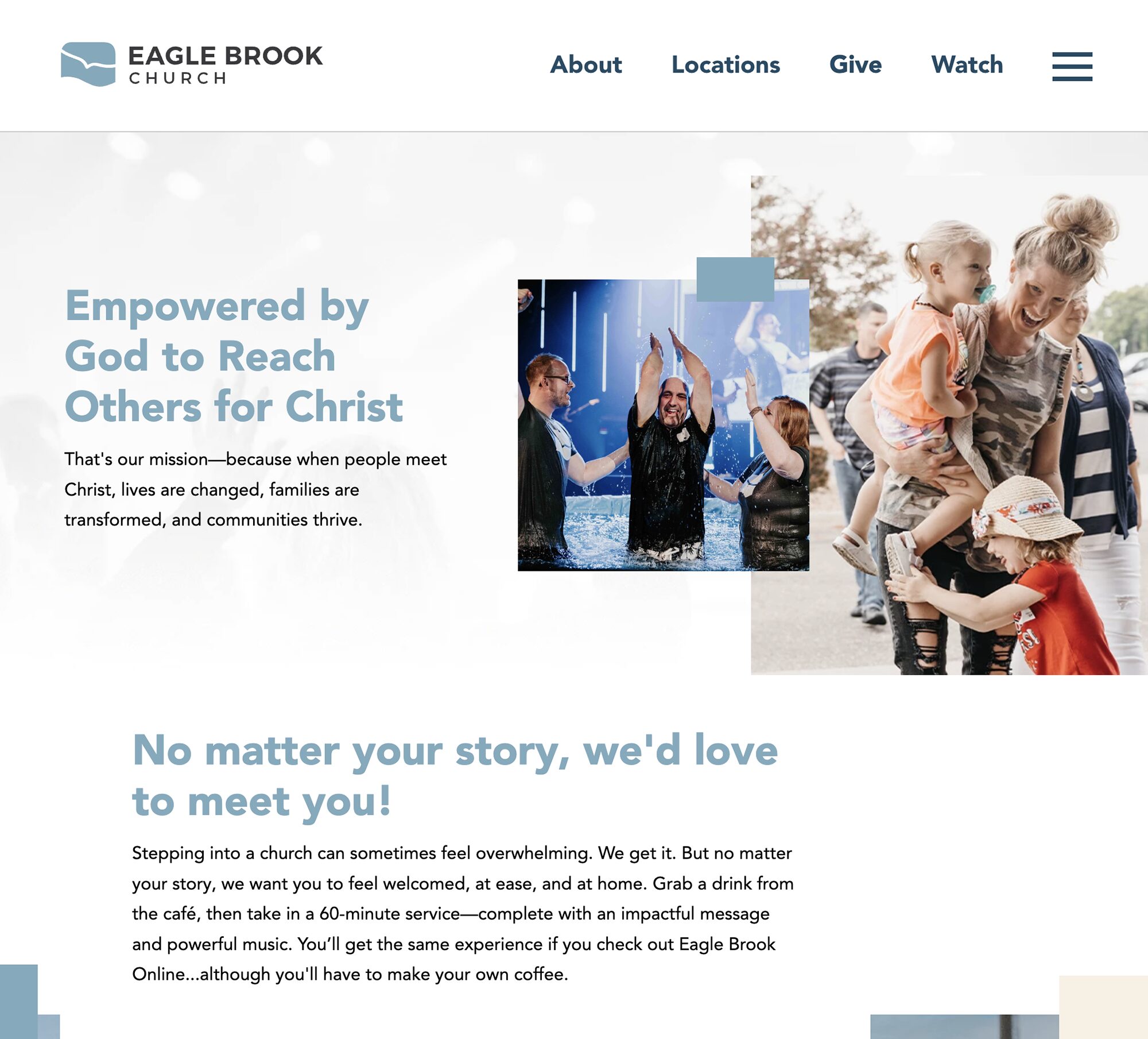
Okay, time for a non-Juxt site! A friend sent me this one for Eagle Brook Church, and I love it. There’s a really clear call to action the second I land on the page. The emphasis on locations and being the first links gives me a visitor-focused vibe. I love the video, and it gives me a really good sense of who the church is, and it does a better job than I think most hero videos do. I love the pseudo-nav at the bottom of the homepage that gives me some really clear calls to action, and the rollover effect and link styling are cool and obvious. The nav is really well organized and easy for me to identify what I’m looking for.
I have a couple of super-picky and minor recommendations here. There are these design “blocks” scattered around the homepage, but they feel either out of place or like I’m supposed to interact with them. I think if there were more, I’d just see them as textural – but I feel like I’m supposed to do something. Also, for as beautiful as this site is, the typography feels like it needs just a little more refinement, especially on the body. I know I’m being picky, and hear me, I love this site, but that little extra bit of polish would make this one of the best sites I’ve ever seen.
Church of the Nativity
https://www.churchnativity.com/
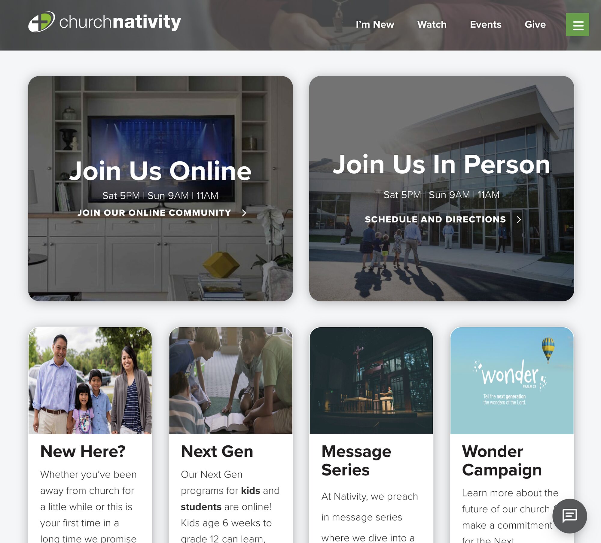
Let’s wrap up this list with one of my favorite sites to work on every week – Church of the Nativity. The team at Church of the Nativity is incredibly intentional and active on their site, which creates a warm sense of welcome when you land on it. I love how, as an active parish, they use their homepage as a navigation portal to help emphasize the most important things going on in the congregation. Their nav feels helpful, not overwhelming, and has clear sections of content for people to engage with while ensuring that key content is highly visible. I have very few recommendations for this, as it works so well for them as a parish.
Okay, well, those are our favorites – what about you? There are so many amazing, vibrant, and beautiful congregations around the world with creative and passionate people designing experiences to help connect people. It’s a huge blessing to our team that we get to be a part of that community that has focus and intentionality towards connecting people to the Kingdom.
If you’re a church leader considering a website redesign, or just curious about how your current site stacks up, we’d love to walk alongside you. Whether you need a new site, want to better serve first-time guests, or need tools or widgets that integrate well, streamline registrations, or highlight upcoming events, we’re here to help. See how we serve churches and get in touch with the Juxt team today!
